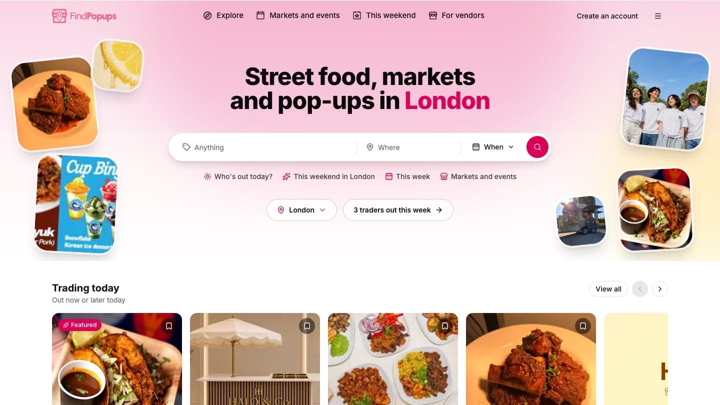
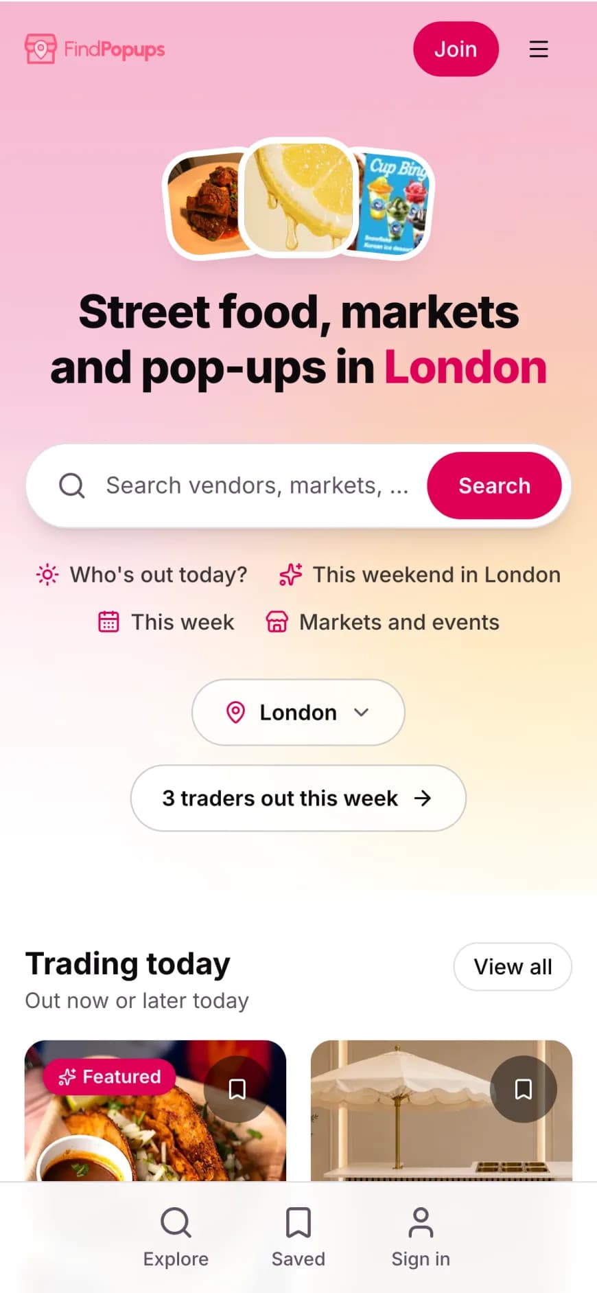
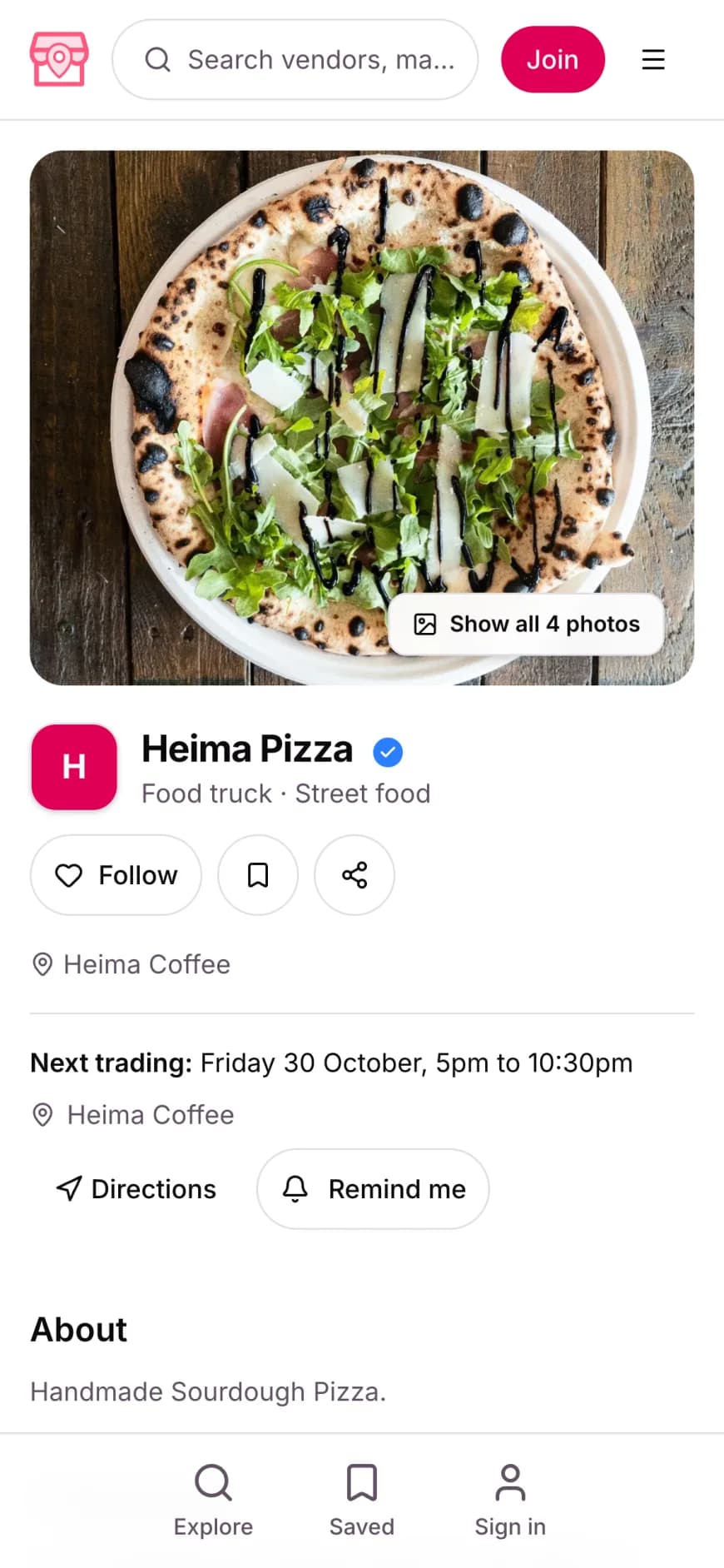
FindPopups: building a two-sided marketplace MVP
My own product. I designed and built it end to end, from the first sketch to the live map and the AI schedule assistant.
- A two-sided marketplace for street food, markets and pop-ups, with a live map
- Founder, designer and developer
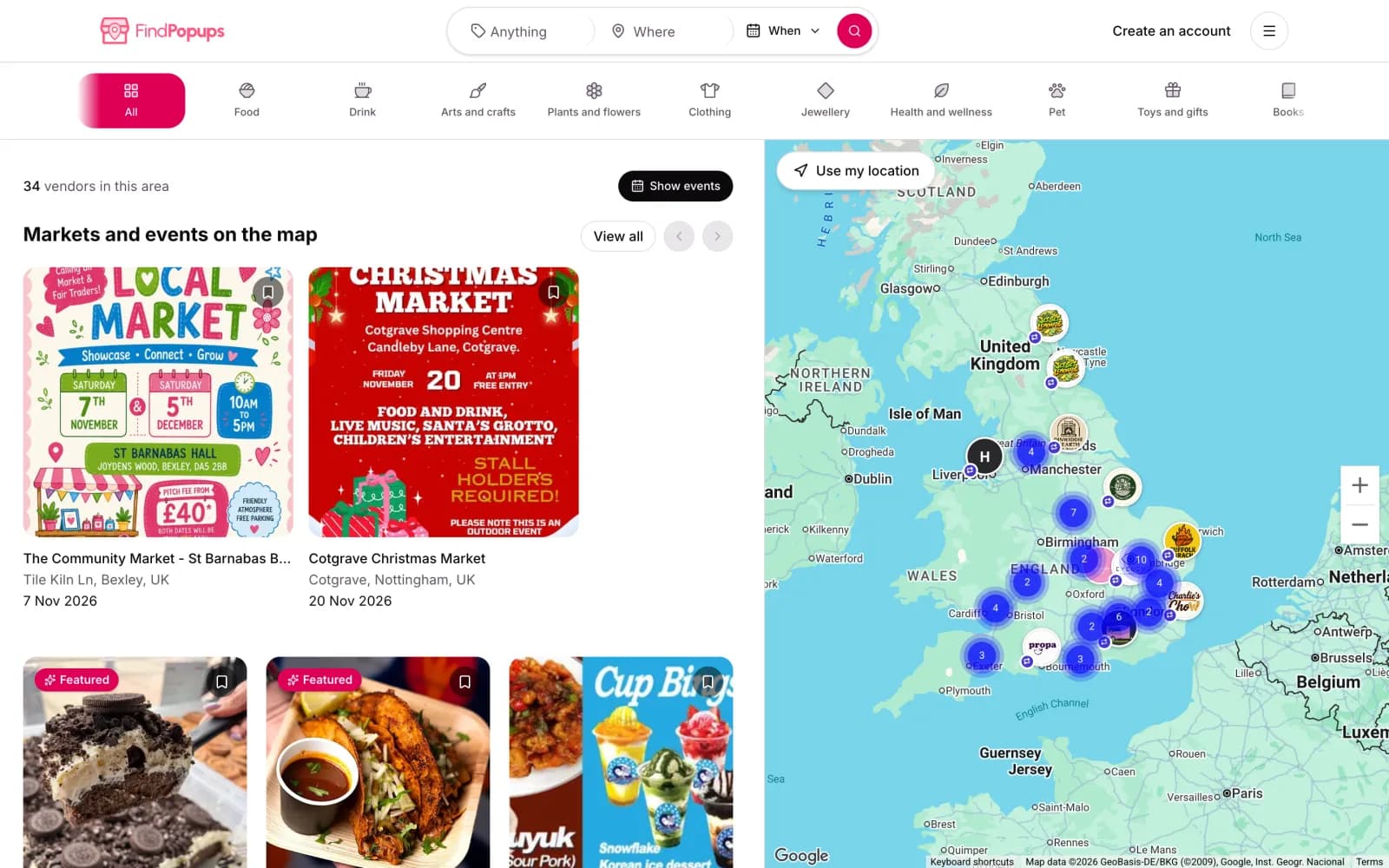
The problem
Street food traders, markets and pop-ups move around, and most of them announce where they will be in a social post that is gone by Tuesday. If you want to find one this weekend, you check a handful of accounts and hope the latest post is current. The people running the events have the same problem from the other side: finding vendors and getting visitors to turn up.
FindPopups puts all of it on one map, with a side for each group.
Research
A marketplace is really two or three products sharing one database. Before drawing any screens I wrote down who was on each side and what they came to do.
- Visitors want to know what is on, where and when. That sentence became the search on the home page.
- Vendors want to be found, and to plan where they trade next.
- Hosts, the people running markets and events, want the right vendors and enough visitors.
Each side also has a different reason to come back. Visitors return when there is something new on this weekend. Vendors return when the platform sends them customers or saves them admin. Hosts return when filling an event is easier than it was before. If any one of those loops breaks, the other two slowly empty out.
The hard part of any marketplace is the empty start. A map that is busy in one city is more useful than a map that is empty everywhere, so I picked one city to launch in: Nottingham, where I live.
UX: flows before screens
I mapped a flow for each side before opening Figma. The visitor flow is short on purpose: search or open the map, pick something, see when and where it is. The vendor and host flows are longer, because that is where the work is: setting up a profile, adding dates and keeping them up to date.
The flows made one thing obvious. Visitors only stay if the listings are current, and listings are only current if updating them is quick for vendors. So the vendor dashboard mattered as much as the public map, even though visitors never see it.
UI: the map is the product
The live map sits at the centre of the visitor side, with listings beside it so you can scan and compare without losing your place. A vendor profile has one job: show what they sell and where to find them next.
I designed the system first in Figma: type, colour, a small set of components for listings, profiles and dashboard tables. Then the screens, desktop and mobile together, because most visitors will open it on a phone while they are already out.
Build
I built it myself, end to end, from the same head that designed it. That meant decisions that would normally go back and forth between a designer and a developer were made in minutes. If a component was awkward to build, I changed the design. If a design needed something the data model did not have, I changed the model.
The build covers the public site and map for visitors, a dashboard for vendors and a dashboard for hosts. On top of that sits the AI schedule assistant.
Launch
FindPopups launched in Nottingham first. Launching in one city kept the map useful from day one and kept the support load to something one person can handle.
What I'd do differently
Every product I have built has things I would change with hindsight, and this one is no different.
Building something two-sided?
Marketplaces cost more than they look, because you are building for two or three groups at once. I wrote up marketplace MVP cost, with what to build first and what to leave out. If you would rather talk it through, book a call.
How much does it cost to build a marketplace MVP?Key screens