Contona.ai: a marketing site for an AI startup
Marketing site, from positioning and page design to the live build.
- A marketing site for an AI content product for e-commerce, designed and built
- Designer and developer
The problem
Contona.ai makes AI content and personalisation for e-commerce brands, and AI products are hard to explain on a home page. Most AI startup sites use the same words, the same gradients and the same vague promise, so a visitor leaves without knowing what the product does or who it is for. Contona needed a marketing site that said what it does in one read and looked like a product worth trying.
Research and positioning
Before any layout, I worked on what the site had to say. For an AI product that comes down to three questions: who is it for, what do they make with it, and why is it better than the general tool they already use.
I looked at how other AI content tools present themselves. The useful finding was not what to copy but what to avoid: abstract hero images and feature lists that could describe any product.
UX: structure before style
I planned the page structure as a story, top to bottom. What it is, a look at it working, who it is for, how it works, proof, and a clear next step. Each section had one job, and anything that did not do a job was cut.
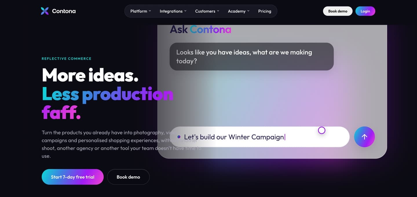
The home page leads with a headline, a demo prompt and the calls to action. Showing a prompt does more than a paragraph of description: a visitor sees the input and gets the idea of the output in a second.
Writing for an AI product
On a site like this the words and the layout are one job, so I worked on them together. A few rules held throughout:
- Name what people make, not what the model does.
- Show the product working before explaining it.
- One idea per section, with a heading that says it plainly.
- Leave out the words every AI site uses, because readers skip them.
UI in Figma
The visual design was done in Figma: type, colour, spacing and a small set of components for sections, cards and buttons. A marketing site for a content tool has to look considered, because the site is the first sample of the product's taste.
My default for an AI product is restraint. The demo should carry the visual weight, so the rest of the page stays calm, readable and quick to scan. Decoration that does not help someone understand the product is the first thing I cut.
I designed desktop and mobile together. Founders share links on phones, and investors open them there too, so the mobile page is not a squeezed version of the desktop one.
Build in Framer
The site was built in Framer. For a marketing site that suits a small team: pages load fast, it handles responsive layouts and animation well, and people without a developer can edit copy and add pages after handover.
Because I designed it and built it, nothing was lost between the Figma file and the live site. Spacing and type were set once, in the build, by the person who decided them.
Launch
The site is live at contona.ai.
A marketing site is never finished at launch. The point of building it in a tool the team can edit is that the next change does not need me.
What I'd do differently
Looking back at any project, there are calls I would make differently.
Need a designer who also builds?
Contona is a small project, but it shows the point. The person who decided how the site should look also decided how it was built, so the live site matches the design.
If you want the person who designs your site or product to also be the one who ships it, I wrote about hiring a product designer who codes and what that changes. Or book a call and tell me what you are building.
Hiring a product designer who codes